


Team Calendar Extension for Azure DevOps: What’s Actually New?
Azure DevOps. Big teams, bigger headaches. Ever try tracking everyone’s vacation days and sprint timelines? You know what I mean: just when you think you’ve finally got it all mapped out—someone goes on leave, someone else starts a new iteration, and suddenly your “master” calendar is more of a mystery than a roadmap. Been there myself, way too many times. February at Logosoft was peak chaos: three competing vacation calendars because nobody trusted the default setup. That’s why when the Team Calendar extension update dropped recently, I stopped everything to see if this thing could finally put an end to our scheduling mess—and figured it’s worth sharing some real-life notes for anyone knee-deep in Azure DevOps like me.
First Impressions: A Face-Lift Worth Noticing
No fluff—right off the bat, you notice the fresh visuals. Feels lighter without losing character (şaşırtıcı ama gerçek). Minimalism done right (not that clinical white-out you sometimes get). Colors actually fit into Azure DevOps now instead of clashing with every other UI element or looking like someone copy-pasted from Windows Vista era plugins.
The icons? They’re much clearer (bizzat test ettim). That weird bell for reminders is gone (thank goodness—I never knew whether it meant alert or just noise). More contrast helps too; after five hours staring at screens on Fridays my eyes aren’t screaming as loudly anymore (ki bu çoğu kişinin gözünden kaçıyor)
Vallahi, Pretty’s nice but function trumps style—that’s my rule after so many years dealing with custom themes clients demand (2022 was wild for this). Most of those “stylish” tweaks actually slowed us down—but here, clean spacing makes life easier instead of harder. Scanning event cards doesn’t make me wish for reading glasses or aspirin.
There’s one thing missing though—a dedicated dark mode toggle for the calendar pane itself would be magic during late-night firefights (trust me… last year my retinas nearly staged a revolt).
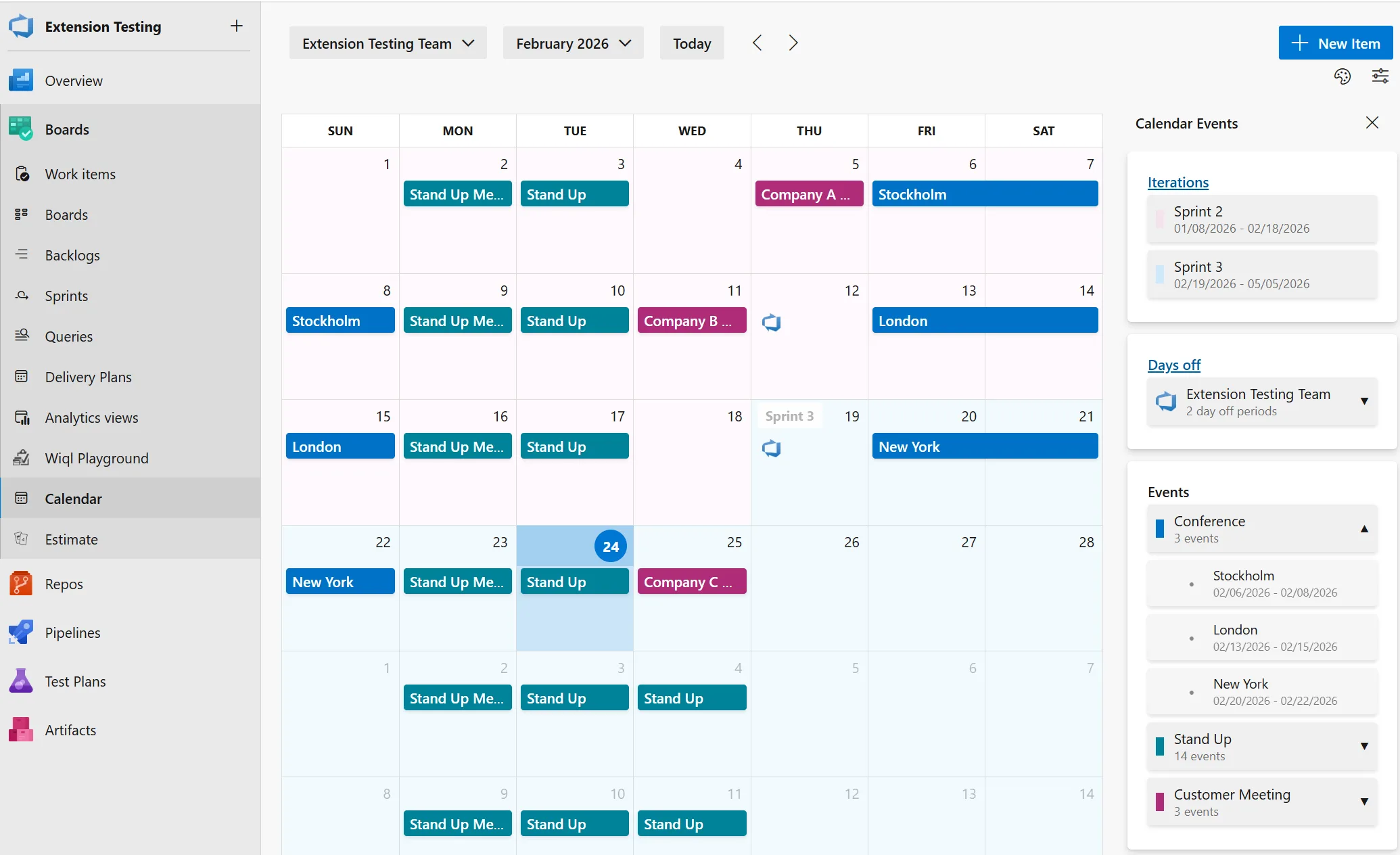
The Sidebar & Panels — Practical Gains
Dürüst olmak gerekirse, This bit isn’t hype—it’s genuinely useful day-to-day. The side panel split now puts Iterations, Days Off, Events each into their own card; breathing room everywhere so nothing crowds out anything else.
Here’s where it gets clever—the panels expand/collapse based on your screen size and needs. Coffee shop testing on my Surface Pro last week? Still readable even wedged between half-eaten muffins and cables! At HQ with my big monitor? Everything stretches out but never feels crowded or overwhelming.
I didn’t expect to love the collapsible sidebar as much as I do now—turns out Deniz (our project manager) uses it all the time during sprint planning to focus only on what matters most; she used to drag windows around awkwardly trying to see more events… no longer necessary!
💡 Note: If you’re juggling multiple screens or running several projects simultaneously, collapsing these panels brings instant clarity—and honestly saves your sanity during those Teams meetings where PowerPoint hogs half your desktop.
Categorized Events & Color Choices — Finally Some Sanity
This feature looks tiny until you use it—and realize how much squabbling it prevents across larger groups! Events are grouped by category now with clear color cues (“release” isn’t confused with “maintenance” anymore), making holiday tracking less painful and release freezes impossible to miss—no joke, we once lost two days figuring out why deployment wasn’t happening since every event looked identical in red before this update came along.
- Expandable categories: Now you don’t scroll forever; open only what you need when you need it.
- Tweak colors freely: Map hues however suits your workflow—or go full corporate branding if that floats your boat.
- Event counts front-and-center: Instantly spot schedule density without hunting around—a little detail that pays off when reporting up-chain quickly.
Bakın, I spent maybe two minutes customizing our Logosoft ticket types colors recently—it paid back immediately since even our delivery lead jumped onboard (“no ambiguous labels!” he said).
The Weak Spot?
If you’ve got tons of micro-event types (“six kinds of maintenance,” etc.), picking unique colors runs thin fast—the palette’s not infinite yet but still miles ahead compared to everyone defaulting blue-on-blue confusion!
Breezier Team Search & Smarter Dialogs
This part caught me off guard—finally something easy about managing lots of teams! In managed services work we might have ten plus squads per customer; previously finding “that one team” felt like hunting needles in haystacks made entirely from needles…
The searchable picker means typing works instantly—you jump straight to target teams rather than scrolling through names all starting “MS-“. One manufacturing client near Istanbul shaved minutes off their weekly calls thanks solely to this tweak—they told me directly (“that alone made Mondays less miserable”).
The dialogs themselves aren’t revolutionary but matter more than they seem—a proper date picker stops confusion over dates (“March 12 vs December 3”—classic mistake), marking days-off isn’t tax-form agony anymore either… overall feels closer to using an app built for humans rather than machines. TFVC Obsolete Policies: Why You Must Remove Them Now yazımızda da bu konuya değinmiştik. Kanban and Sprint Boards: Surviving the Screen Space Crunch yazımızda da bu konuya değinmiştik.
User Experience Changes That Don’t Get Enough Credit
You ever notice small improvements stack up quietly until suddenly things feel less annoying? Better spacing between cards here helps—a lot—with readability going way up too (even Ekin from QA ditched her custom theme because defaults looked good enough!). Icons look modern—not relics from Windows XP—and transitions aren’t jarring whenever you switch views mid-sprint either.
- Smoother movement between sections: Makes cross-team management easier especially under pressure
- Easier reading: Accessibility gains matter—less eye strain means fewer headaches
- No breakages whatsoever: Didn’t re-train anyone last week unlike previous rollouts which were… rough
A Couple Things Still Missing…
If only recurring events worked natively instead of clunky workarounds! And Outlook integration? Would turn good into great—but hey, what exists today is surprisingly decent… definitely beats hand-syncing Google Calendars manually (don’t ask how bad ours broke in early ’21).
BOTTOM LINE — Should You Bother?
If you’re already using Team Calendar in Azure DevOps then yeah, grab these updates ASAP—they won’t disrupt workflows but absolutely smooth them out day-to-day (might even make planning fun?!). If you’re sitting there thinking “another calendar tool?”… I’d say run a trial next sprint cycle anyway; worst-case scenario = cleaner interface + better navigation, best case = dodging classic scheduling disasters.
Quick switches between teams and clear event groupings don’t sound earth-shattering—but spread across dozens working together month-in/month-out? Those saved seconds add up faster than you’d think.
If you want stories straight from migration trenches or curious about other Azure DevOps upgrades—I’ve got plenty more practical takes over at Build Identities in Azure DevOps – The Temporary Rollback Nobody Saw Coming (evet, doğru duydunuz)
I’ll keep stress-testing these calendar features as we ramp them up at Logosoft—and promise updates if anything explodes…or quietly fixes stuff nobody notices till Monday morning rolls around again.
Şöyle söyleyeyim, Sourced from Microsoft itself:
Updates to Team Calendar extension
Share this:
Related Posts
Azure SDK March 2026 Release: Surprises, Frustrations, and What Actually Matters27 Mar 2026Azure CLI’s New AI Agent Logs: Real Debugging Without the Portal Headache25 Mar 2026GitHub Copilot Custom Agents in Azure Boards: My Take on the Real Impact24 Mar 2026Azure Developer CLI in 2026: JMESPath Queries, Slot Deployments & Real Surprises26 Mar 2026


Post Comment