


Kanban and Sprint Boards: Surviving the Screen Space Crunch
Alright, let’s just jump right in. If you’ve spent any real time wrangling Azure Boards—honestly, I’ve lost count of how many teams I’ve seen struggle with this—you’ll recognize the pattern: backlogs balloon out of control, work item cards become overloaded with tags and custom fields, and soon enough nobody can tell what’s actually happening unless they squint like a hawk. That gets even messier on a projector or one of those tiny conference room laptops. And then… suddenly you notice a “condensed view” toggle sitting up there—one click—and weirdly enough? It actually fixes more chaos than I’d expected.
The Real Estate Problem: Too Many Cards, Not Enough Space
Let me paint you a picture. January 2023, Ankara—I’m stuck in a meeting with a logistics company, knee-deep in pipeline refactoring. We pop open their Azure Boards Kanban for quarterly review and—no joke—the Product Owner nearly does a spit take when he sees his board. With all the custom fields jammed onto each card (tags everywhere), we could see maybe five cards per column before endless scrolling kicked in. The whole thing looked like tag stew. Ring any bells?
Microsoft tried to smooth things over when they launched the New Boards hub; extra padding, more whitespace… sure it was cleaner, but now every meeting involved twice as much vertical scrolling just to scan half your backlog. For big teams that deal with dozens—or heck—even hundreds of items at once? This isn’t just frustrating—it slows down decisions during standups and sprint planning.
No matter how dialed-in your workflow is, if half your crew can’t instantly spot the key cards on-screen… mistakes are going to sneak through.
İnanın, I’ve seen folks drop browser zoom down so far everything turns microscopic or frantically strip card fields just to make boards less overwhelming. Nobody enjoys that.
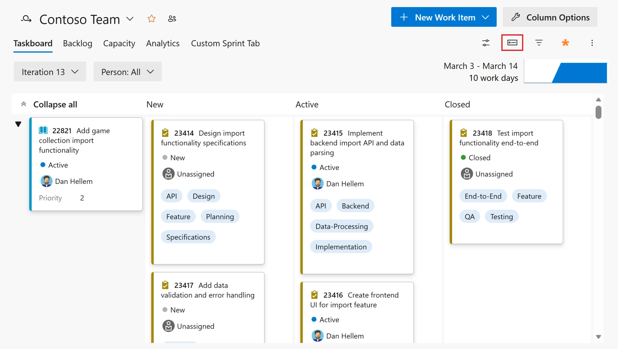
The Condensed View Switch: What Does It Actually Do?
This is where things get fun—for once! Condensed view landed on both Kanban and Sprint boards inside Azure DevOps recently; all it takes is flipping that little toggle next to board controls and boom! Suddenly each card collapses down so only its ID plus title are visible (unless you’ve set something different). No fiddling around menus required.
You think it’s minor—but trust me, use it live during an actual session (like we did last week at Logosoft’s hackathon retro over in Istanbul) and watch what happens. Instantly our team could see two or three times as many work items per screen compared to the old layout—all without needing thumb acrobatics on trackpads or hunting through long lists for stories/bugs mid-meeting.
Way less brain strain too—especially handy when triaging bugs or yanking tickets for sprints!
💡 Note: You won’t have to hunt around for condensed mode—it sits right by your board controls up top! If you’re demoing stuff in meetings or need quick status snapshots mid-sprint? You’ll be surprised how fast switching between full detail and summary view speeds things up.
Sprinting vs Kanban: Is Condensed View Always Better?
I’m not going to sugarcoat it—condensed mode shines during backlog reviews or massive planning sessions but isn’t always ideal day-to-day.
There are plenty of cases where seeing assignees, blocked flags or priority tags directly matters way more than squeezing extra cards onscreen.
- Sprint Planning: When scoping dependencies across several columns? Condensed makes rapid scanning easy — especially spotting leftovers from previous sprints.
- Standups: But sometimes you genuinely need those details visible — like who’s working which story or why something’s blocked — without jumping into every card individually.
- Triage Meetings: During bug bashes/hotfix scrambles condensed lets you identify clusters fast—but context sometimes still wins out over density.
Eren from our cloud migration squad summed it up best after our last sprint call; he found toggling condensed/full modes was faster than wrestling filters/views throughout long meetings anyway.
Not bad if speed matters!
A Few Gotchas (And A Little Disappointment)
Açık konuşayım, If only every update was perfect…but here comes reality:
- Bespoke automations based on rich layouts? Sorry—they vanish completely under condensed mode since only IDs/titles show up now.
- No way yet to pick which fields display when collapsed—it’s strictly minimal info by default so far.
- If you’re running legacy extensions built for classic UI layouts… expect occasional glitches.
We saw alignment weirdness hit Edge last Thursday thanks to an old workflow plug-in still lurking around.
The trade-off? Switching views costs nothing—and most teams barely notice these quirks given how simple swapping modes has become.
Plus Microsoft says rollout goes org-wide automatically by early March according to their latest docs—not much friction left at all really! (bizzat test ettim) Azure DevOps Server Patching in 2024: Why You Shouldn’t Ignore It yazımızda da bu konuya değinmiştik. GitHub Copilot Custom Agents in Azure Boards: My Take on the Real Impact yazımızda da bu konuya değinmiştik.
Tactical Advice from the Trenches
If you’re herding huge portfolios—with hundreds of epics/features floating around—a quick tip:
Train product leads how/when condensed view works before major review calls.
One large healthcare client cut literally hours per month off wasted scroll-time doing this back in May ’24 (no exaggeration). Remember these tricks:
- Tackle prioritization using condensed first; drill into full detail later as needed
- Pivot back whenever daily standup blockers crop up that require field visibility
- If anyone panics about missing data remind them—all detailed info lives one click away anyway!
Bigger Picture Impact
I’ll admit—I spent years watching DevOps tools roll out features purely for buzzword bingo (“AI-powered!” etc.)
So my first reaction was skepticism about whether shrunk-down cards would help beyond visual tidiness alone.
Turns out… not true.
Not revolutionary—but practical enough that I’d urge any Azure DevOps admin try this toggle before their next PI planning session.
Less clutter equals sharper focus.
Sharper focus means stronger discussions.
Stronger discussions generally lead to fewer costly slip-ups downstream…
Or so we hope!
This isn’t about saving pixels—it’s making sure people spot what matters quickly enough before decisions spiral sideways.
Where To Next?
If Microsoft gives us even basic customization over collapsed card fields soon?
That’ll flip this from “nice touch” straight into can’t-live-without territory,
especially inside sprawling orgs juggling cross-team complexity daily.
Meanwhile—
If you’re curious about other fresh tricks rolling out across Azure DevOps lately (and there’s been quite a few),
take a peek at Team Calendar Extension for Azure DevOps – What’s Actually New?.
Seriously worth tracking if keeping pace matters!
Bottom Line
This feature isn’t earth-shattering tech—but boy does it land exactly where everyday pain builds up inside Agile practice within Azure Boards.
So next time your team drowns beneath tag overloads/cards bursting with metadata during morning standup?
Hit that condense toggle.
See if life gets easier—for your eyes AND your crew.
Done.
Source: Condensed views on Kanban and Sprint boards
Share this:
Related Posts
Azure Developer CLI’s New AI Agent Commands: Local Testing Finally Doesn’t Suck25 Mar 2026Team Calendar Extension for Azure DevOps: What’s Actually New?23 Mar 2026Azure DevOps Remote MCP Server Preview: Real-World Impressions and Tips22 Mar 2026From Laptop to Live AI: Deploying Agents to Microsoft Foundry with Azd25 Mar 2026


Post Comment